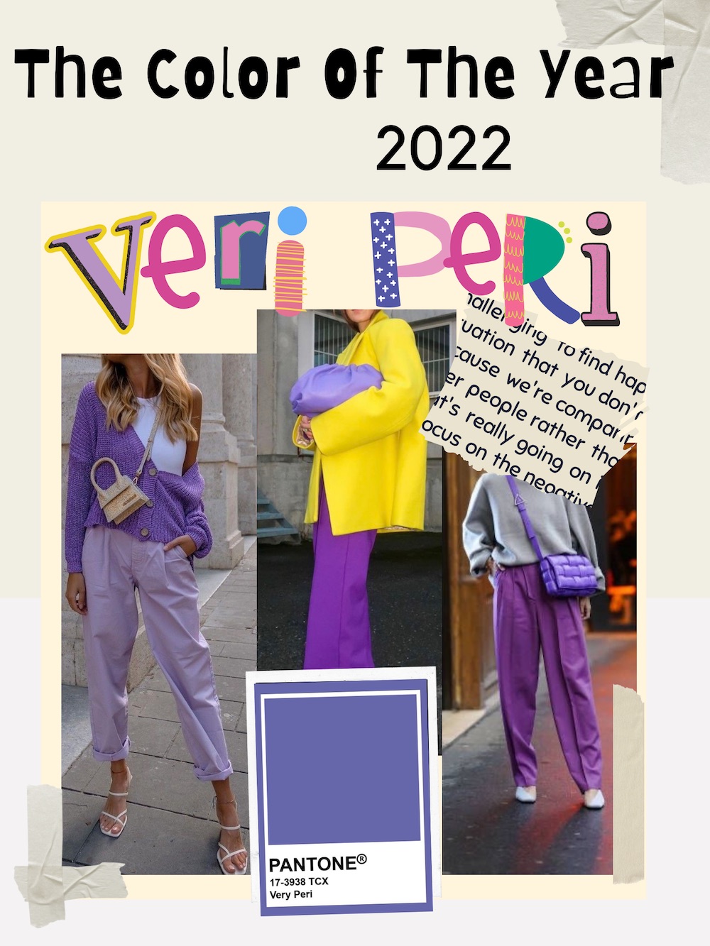
After knowing which color will predominate in 2022, I started to think about how I was going to combine it, which colors might suit me the most to put together my outfits.
Tell me in the comments below what you think of the Pantone color of 2022.

In 2020 the Pantone color was Classic Blue, but the color that was very present during the year was Lavender, Veri Peri seems to me like a combination of both colors. Although at first I wasn't that enthusiastic about this color, seeing the extravagant combinations and how pretty it looked when combined with other complementary colors, I decided to give it a try. Now that I can reinvent my favorite outfits with a touch of new color, I'm excited to know what I can create.
We live in times of transformation. PANTONE 17-3938 Very Peri is a symbol of the spirit of our current global era and the transition we are experiencing today.
PANTONE
Veri Peri gives me vibes of an elegant color, so I want to play in 2022 with different, more fun combinations that perhaps I didn't dare to in 2020.
What are complementary colors? They are those that are located at the opposite end of the color wheel.

Knowing this will make it easier for us when choosing our clothes, if what we want is to combine it with complementary colors.


By dressing in monotonous colors, it gives us an optical illusion that it lengthens our body, and in my opinion it is quite elegant. I try to apply this trick with my clothes and I really like it.


One of my favorite combinations is with a vibrant color like yellow, I love the touch of color in shoes or accessories like bags. In a monotonous look where everything is Veri Peri, adding an intense color like this can really lift your outfit.

As with yellow, a touch of orange will undoubtedly give vitality to your outfit. Heels, bags or some other accessory are welcome to give it that touch of color. This combination reminds me of October and Halloween season.
If we are looking for something more formal, without a doubt combining it with white or beige will be our ally color. I have to say that I am fascinated by how it looks, simple but elegant.


Lately on Instagram I have seen color blocks, it is something that has become very popular. I love it when it is combined with monochromatic colors and accentuated at the end with a touch of color. Leonie Hanne He always knows how to handle it very well.

A monochromatic outfit and a touch of color. This is one of my favorite combinations, I usually use monochromatic colors since I feel that they elongate my figure. In this case I like the way the monochromatic blue looks with a touch of Veri Peri.
Honestly this is one of my least favorite combinations, it reminds me of Barney the dinosaur. However, I must say that by turning it into a tri-tone color blocking outfit, it can actually look cute to me.
Something casual, but the color combination seems formal to me. Classic and easy to combine, denim or gray scale where we can use the Veri Peri to accentuate our outfit.

Red will always be a passionate and captivating color. I never thought I would like the way these two colors look together, it's elegant and I could wear it day or night.
Remember that you can use and combine with the colors that you like the most, in fashion there are no rules but it is about enjoying yourself and feeling comfortable with yourself. I like to try new things and try to look pretty for myself. Leave me in the comments what you thought of this article and what color combination you liked best with Veri Peri.


This piece of writing offers clear idea for the new users of blogging, that really how to do blogging.